- Images don’t noticeably affect open and reply rates.
- Images can hinder deliverability if used inappropriately via the spray-and-pray technique and high volumes.
- Images are essential for product PR.
- Images can be a difference-maker for expert commentary as fake experts are at an all-time high, especially in the UK.
- Data images and graphs can be a great way to clearly convey key information, but aren’t always necessary.
A picture is worth a thousand words. But does this apply when pitching journalists?
While attachments are pretty much universally scorned, in-line image use is a mixed bag. And based on our research, it’s used regularly by some digital PR professionals.
In this study, I wanted to break down how image use affects journalist engagement using our data and insights gathered from pros and journalists alike.
Methodology
To filter out noise from follow-up, quick-reply, and conversational emails and focus only on pitch emails, I looked at engagement data from anonymized BuzzStream emails with bodies longer than 100 words. We looked at a subset of agencies that primarily do digital PR.
How Many Digital PR Pros Use Images/Graphics in the Email Body?
Based on our dataset of about 5.6 million emails, just 18.8% include images in their pitches to journalists in the email body.
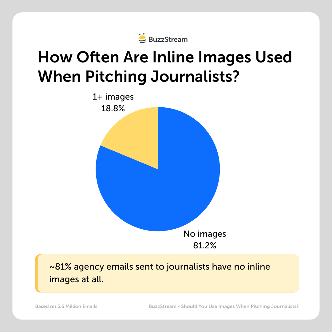
Note: Although I’ve been writing a lot about the differences in digital PR in the US vs UK, this is one area where both do it at the same rate.
How Many Digital PR Pros Send Emails With Image/Graphic Attachments?
Just 0.1% of digital PRs use attachments when emailing journalists.
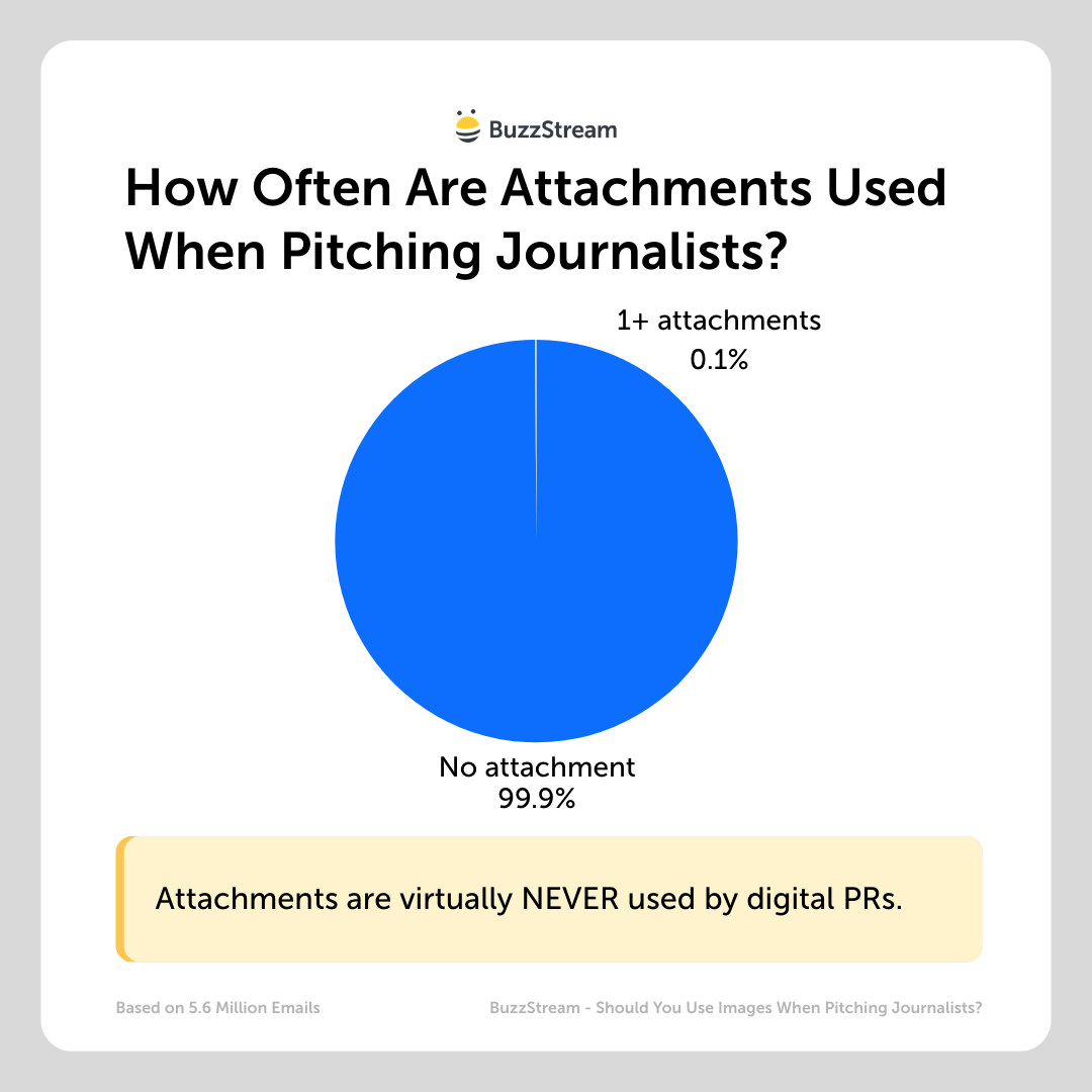
Spam filters are even more allergic to attachments, so digital PR pros seem to avoid them altogether.
So, for the sake of this study, we are ignoring attachments altogether.
Do In-Line Images/Graphics in an Email Pitch Impact Engagement?
Overall, there is only about a 1.25% increase in open rates for emails with inline images vs those without.
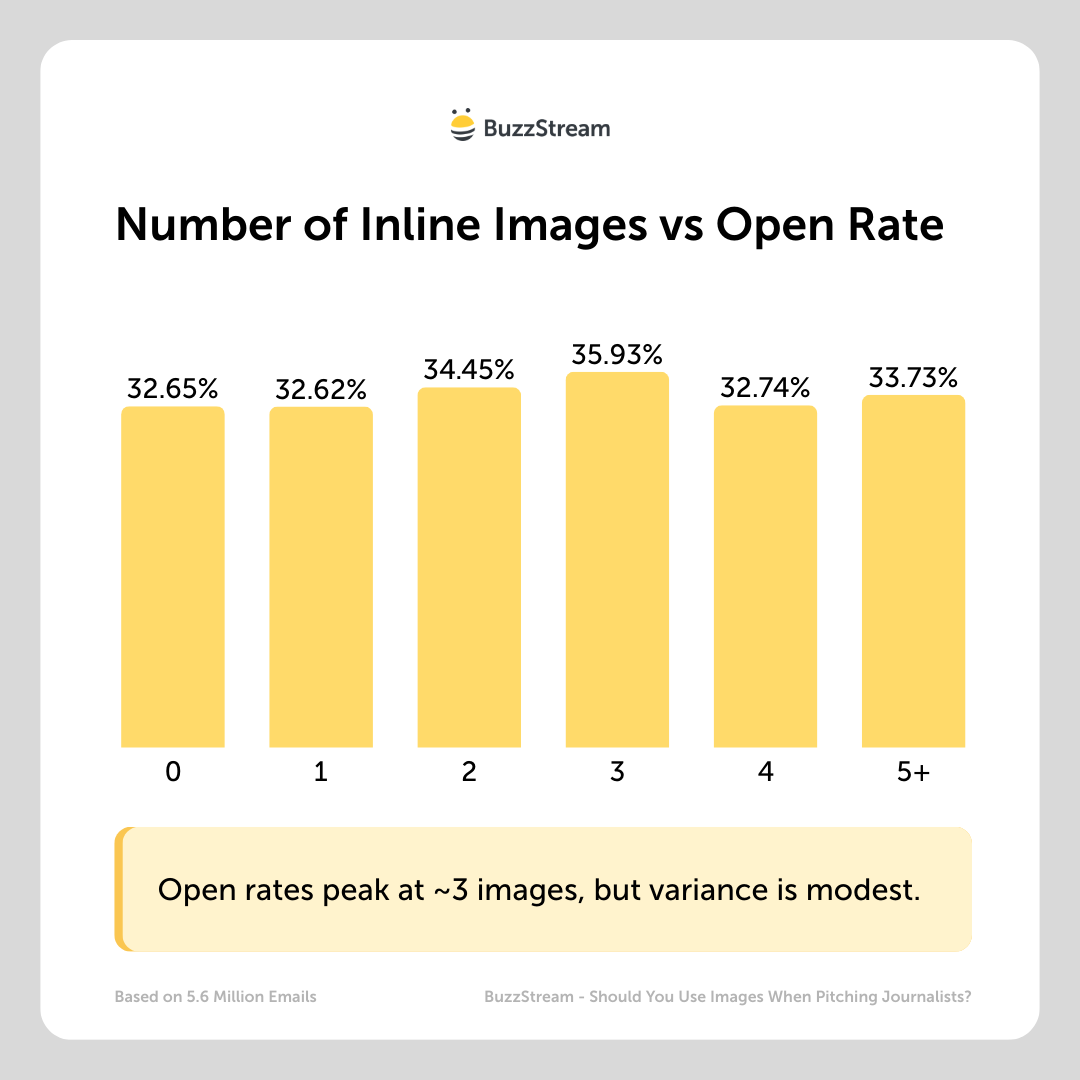
And while you would most likely have to open an email to discover an in-line image is there, my theory was that perhaps the more images you have, the more likely it is to appear in a promotions filter or, at worst, spam.
But based on this data, the presence of images likely doesn’t impact where the emails get placed, as they get relatively similar open rates either way.
The impact on reply rates is a little more pronounced, but tough to draw conclusions from:
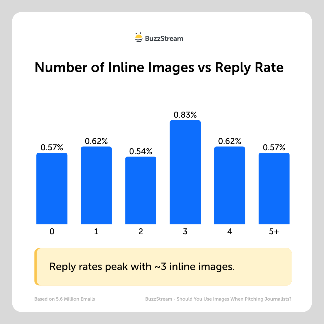
It peaks again at 3 images.
So the data doesn’t really help us out.
The real question here is ultimately whether journalists are more likely to cover posts with images, and for that, we’ll need to dig deeper.
Are Journalists More Likely to Cover a Story if the Pitch Has Images/Graphics?
It depends.
First off, there are two key studies from Cision and Muck Rack that outline what journalists actually want.
In both cases, images (images, infographics, high-resolution images) are low on the list of needs.
Cision found that 30% want multimedia (videos, images, infographics, etc.) when asked what kind of content they most want to receive from public relations professionals.
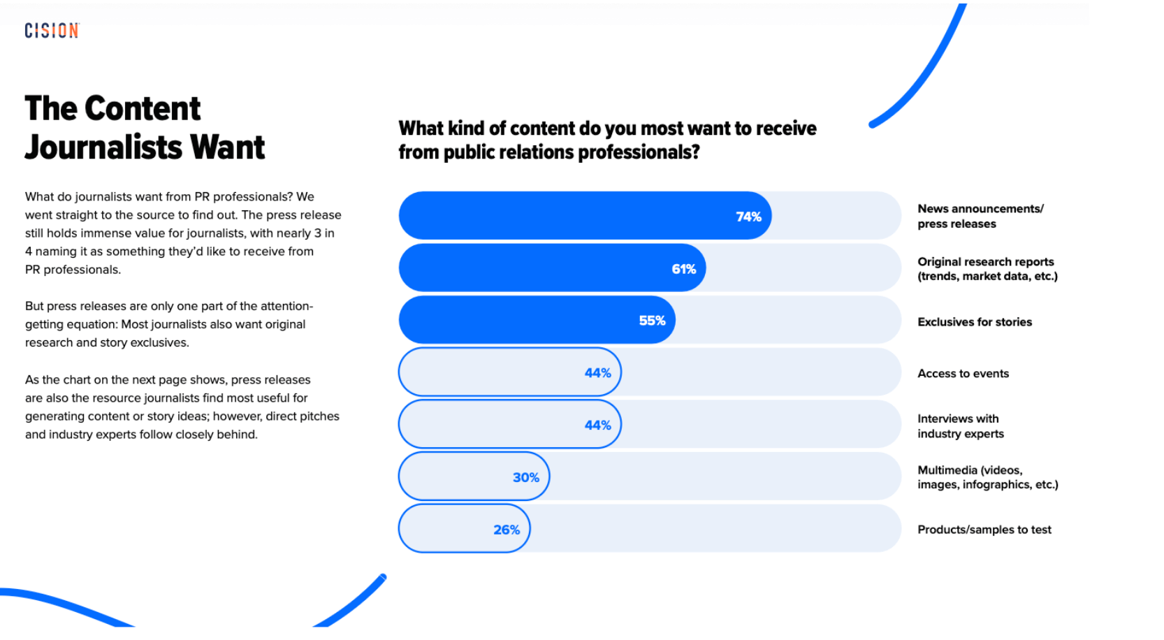
This was 6th out of 7 options, just below interviews with industry experts and just above products/samples to test.
Muck Rack found that 36% want high-resolution images when asked which a PR pro ideally offers alongside their story pitch
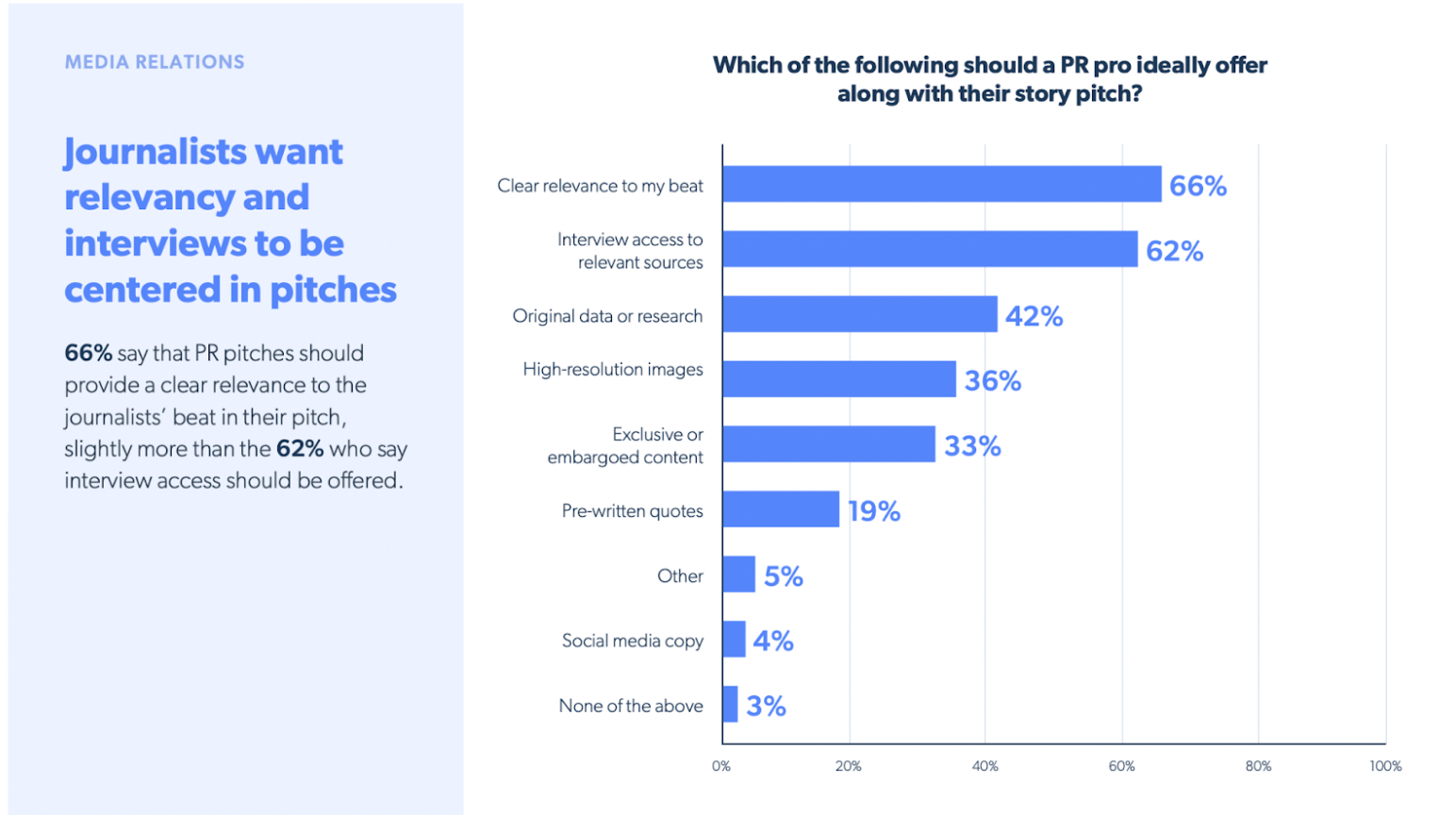
This was 4th out of 9 options, just below the original data and just above the exclusive content.
But again, this really varies by story type, industry, and the kind of PR you are doing.
Here’s what the journalists I interviewed thought:
Use Photos in Your Product Pitches
If you’re doing product pitches, you typically send them a photo.
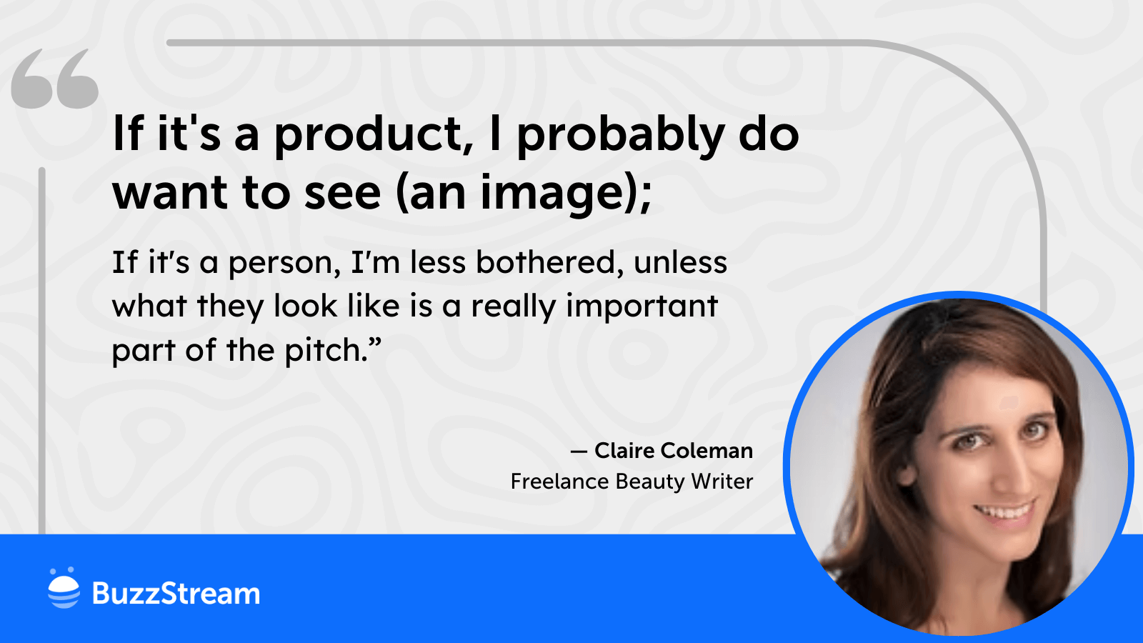
Claire Coleman, Freelance Beauty Writer and author of Beauty Geekery Substack, told me, “An image has to add to a story, not just be there for the sake of it.
If it’s a product, I probably do want to see it; if it’s a person, I’m less bothered, unless what they look like is a really important part of the pitch.
But Claire also tells us to be mindful of the image sizes.
“By all means, tell me images are available and include low-res pictures, but any pitch that contains a hi-res image that slows everything down, or an image I need to download, makes me less likely to cover it.”
Use Graphics to Provide Extra Context
It seems that, in general, most journalists I’ve talked to are a little more interested in graphics than images or photos.
Noah Zuss, former finance reporter, is all about graphics.
“PR pros should include graphics, using images sparingly. Most images are filler as opposed to a graphic.
Unless the PR pro places images of a new product, screenshot and capture of some new capability or digital feature a PR pro wants to draw attention to.”
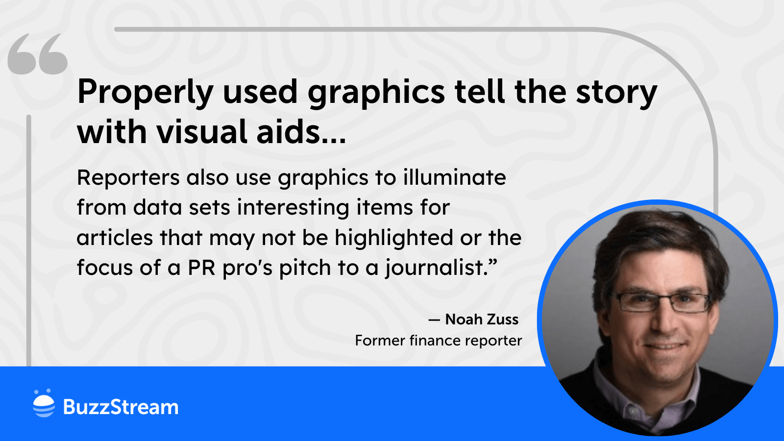
Noah also pointed out how the images can help point out interesting facts and stats:
“Properly used graphics tell the story with visual aids, context, and provide more information. Visual aids such as graphs can be very useful to journalists.
Reporters also use graphics to illuminate from data sets interesting items for articles that may not be highlighted or the focus of a PR pro’s pitch to a journalist.”
Use Graphics for Experts
Freelance journalist Lindsay Dodgson said, “It’s hard for me to imagine a case where a photo, or a lack of one, would make or break me taking on a story.
It really does depend on the type of story and the outlet I’m pitching to, though. Some outlets prefer to have photos of sources named in a piece, but others aren’t so bothered.”
This isn’t overly surprising. But she went on to say how they may be a differentiator when pitching experts:
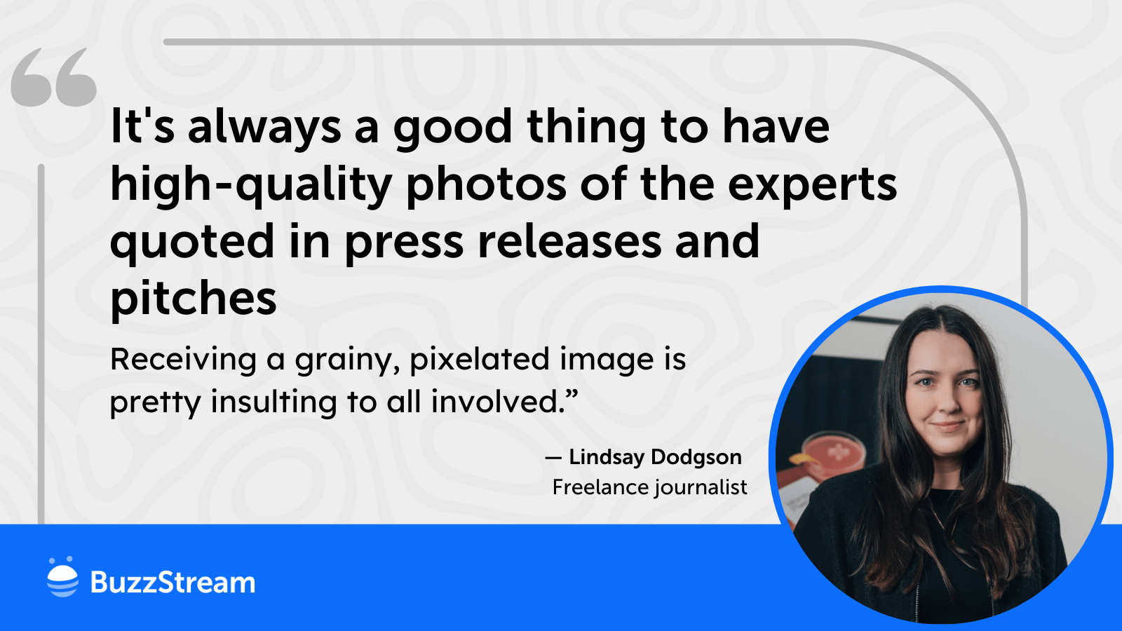
“I would say it’s always a good thing to have high-quality photos of the experts quoted in press releases and pitches, regardless, because receiving a grainy, pixelated image is pretty insulting to all involved.
I’ve actually taken people’s quotes out of stories before because the photos their PR representatives sent over were so unusable.
If the story is data-driven, I think having a graph would be more useful. Photos can sometimes make a story on their own.
But overall, if a pitch is good, and the story is there, a photo is unlikely to be the thing that it hinges on.”
Clearly, the idea here is to at least be ready with photos and images, but it won’t earn you coverage.
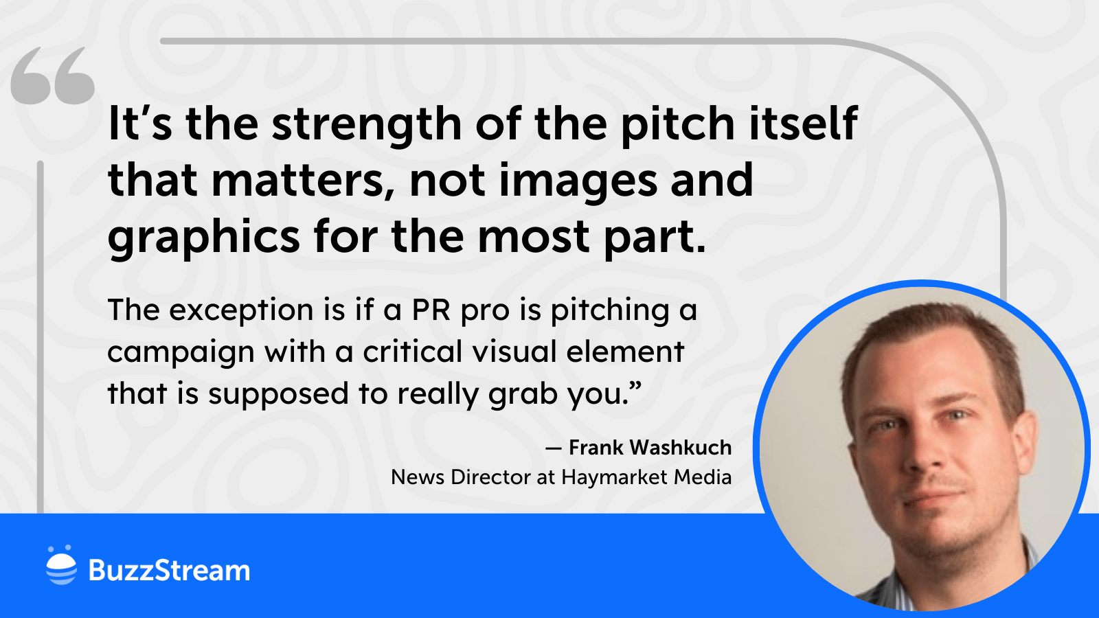
Frank Washkuch, Executive Editor at Haymarket Media, echoed Lindsay’s final remarks:
“It’s the strength of the pitch itself that matters, not images and graphics for the most part. The exception is if a PR pro is pitching a campaign with a critical visual element that is supposed to really grab you.”
Ultimately, it’s all about the pitch, not the words.
Don’t Forget the Links
One way to make things easier for journalists is to link out to all of the assets.
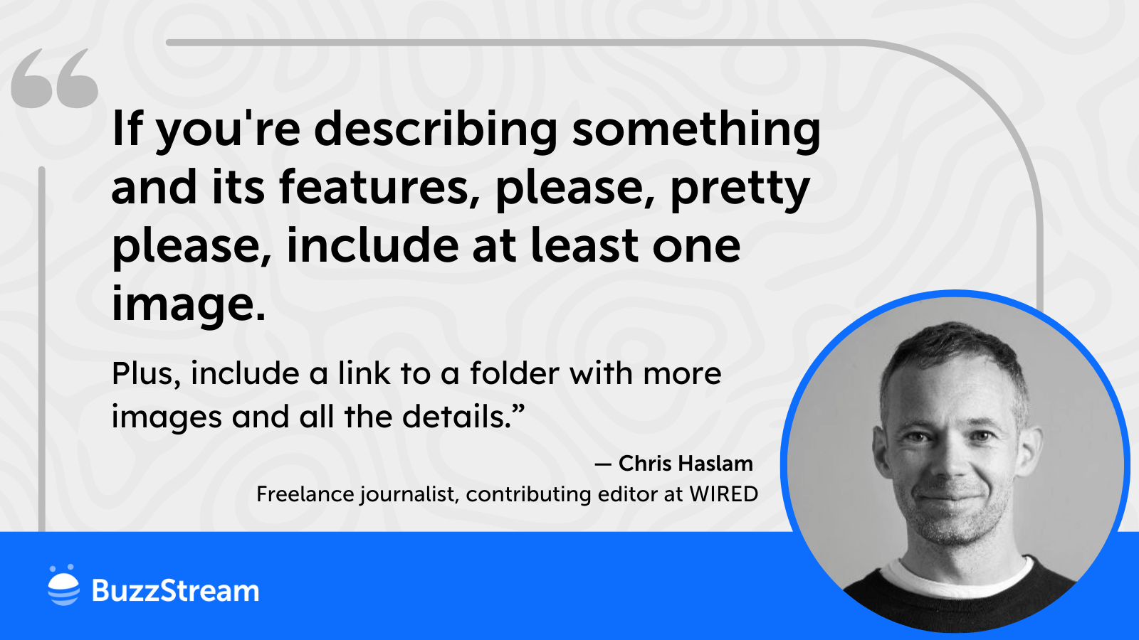
Freelance journalist and contributing editor at WIRED, Chris Haslam, told me that “If you’re describing something and its features, please, pretty please, include at least one image, plus a link to a folder with more images and all the details.”
I also love this little snippet gem of a quote he said: “Those who ignore the saying ‘a picture paints a 1000 words’ have obviously never succeeded in consumer PR.”
We’ll see this one mentioned in the next section by some of the digital PR pros as well.
What Do the Digital PR Pros Say?
There are some digital PR pros who have been in the game for a long time and have strong opinions on when and how to use graphics.
Images Make it Scannable
Becky Lindsay, Digital PR Executive at Digitaloft:
“I tend to use imagery when pitching larger, data-led campaigns as I feel it really helps give a snapshot of the findings.
As PRs, we’re all very much aware of how busy journalists’ inboxes must be, so offering imagery when pitching really helps provide clarity and context and allows the reader to skim the pitch instead of reading the whole thing.
The use of thoughtful images, like easily digestible charts and infographics, helps my pitches stand out.
I’m unsure whether the use of imagery is the reason for this, but I’ve also noticed that open rates are usually higher when relevant imagery is used within the pitch.”
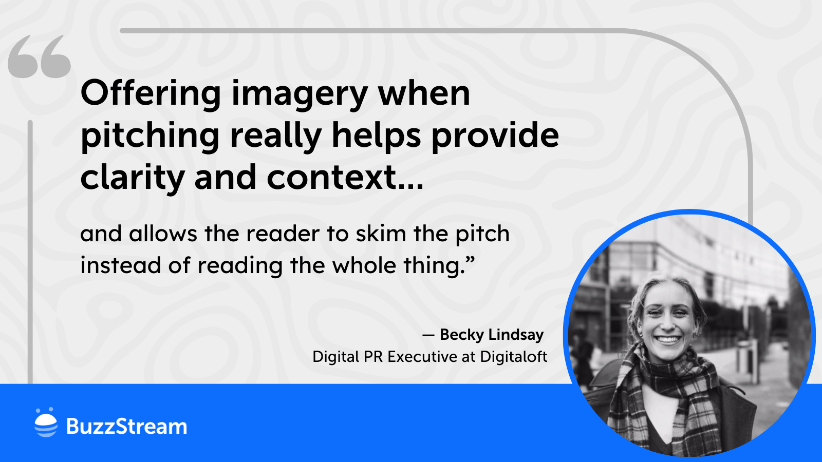
Here’s an example of a pitch from Becky’s team that shows how an image can quickly get the point across.
Data and Maps
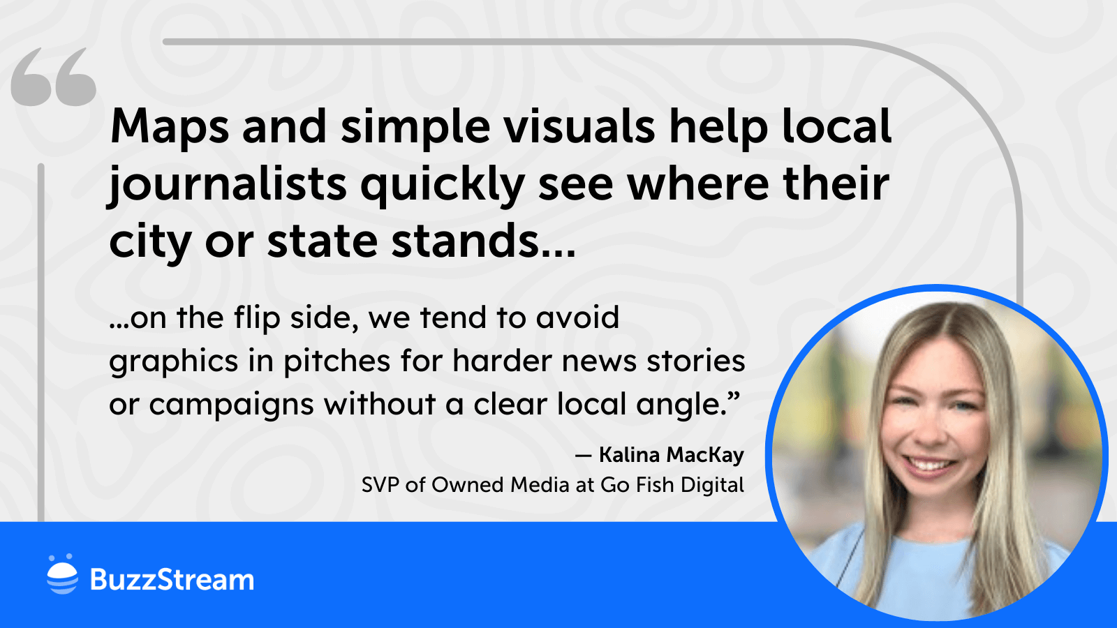
Kalina MacKay – SVP of Owned Media at Go Fish Digital,
“We do use graphics pretty regularly, but not a hard and fast rule, unfortunately.
Generally, we’re more likely to use graphics when we have maps (i.e. city/state rankings, Google Trends, or state-by-state surveys).
Maps and simple visuals help local journalists quickly see where their city or state stands, compare it to others, and spot angles that are most relevant to their audience (i.e. one journalist might want to focus on differences between North and South Carolina while another might want to tailor their story to North Carolina insights – the map allows for both without a lengthy pitch).
On the flip side, we tend to avoid graphics in pitches for harder news stories or campaigns without a clear local angle.
Those are usually more text-driven, and we want to keep the focus on the key insights rather than risk overwhelming people with too many stats on a graphic. That said, 100% of our campaigns do include graphics on the landing page itself.”
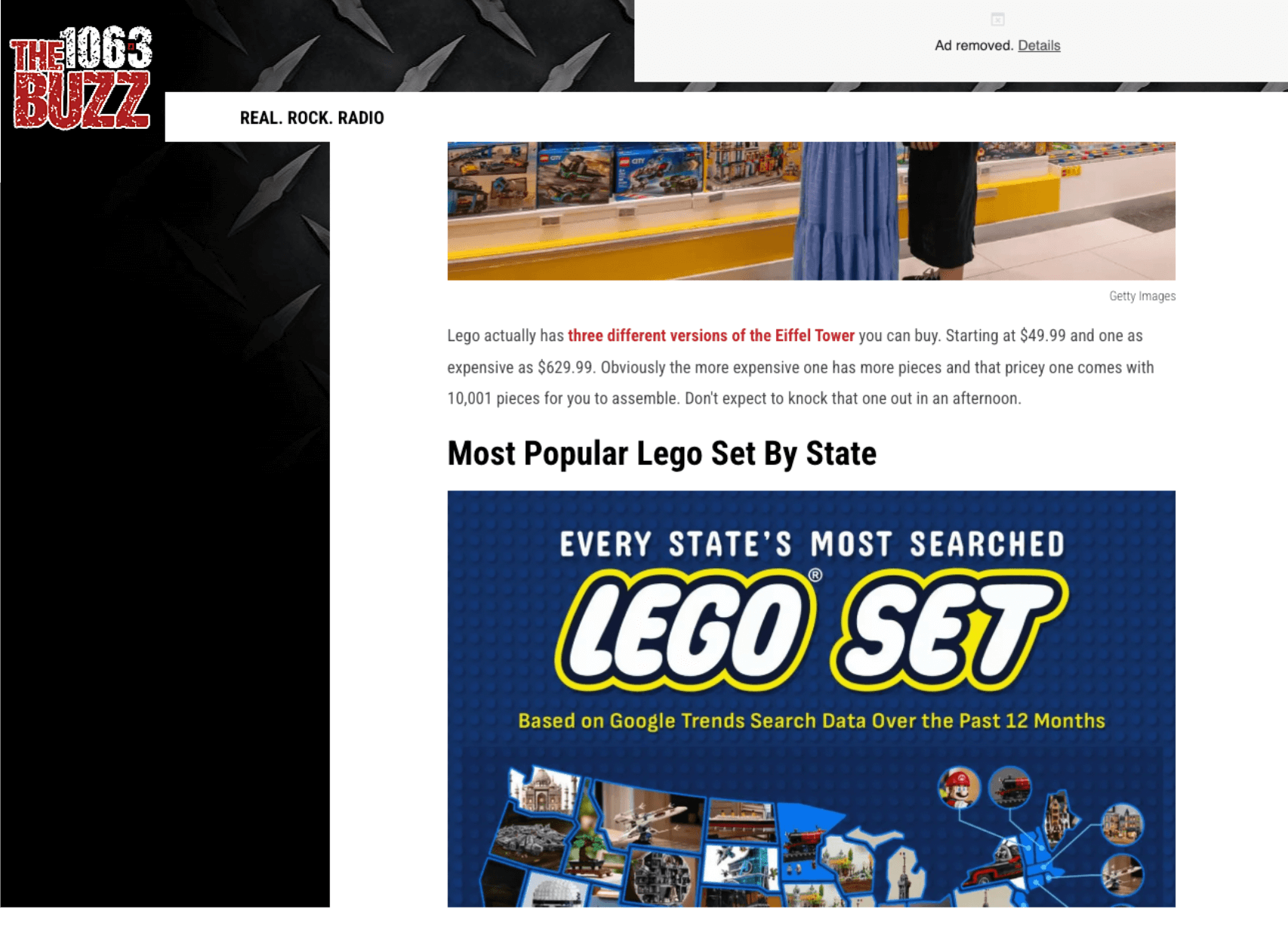
For example, here is a pitch from Kalina’s team around a map piece for National LEGO Day:
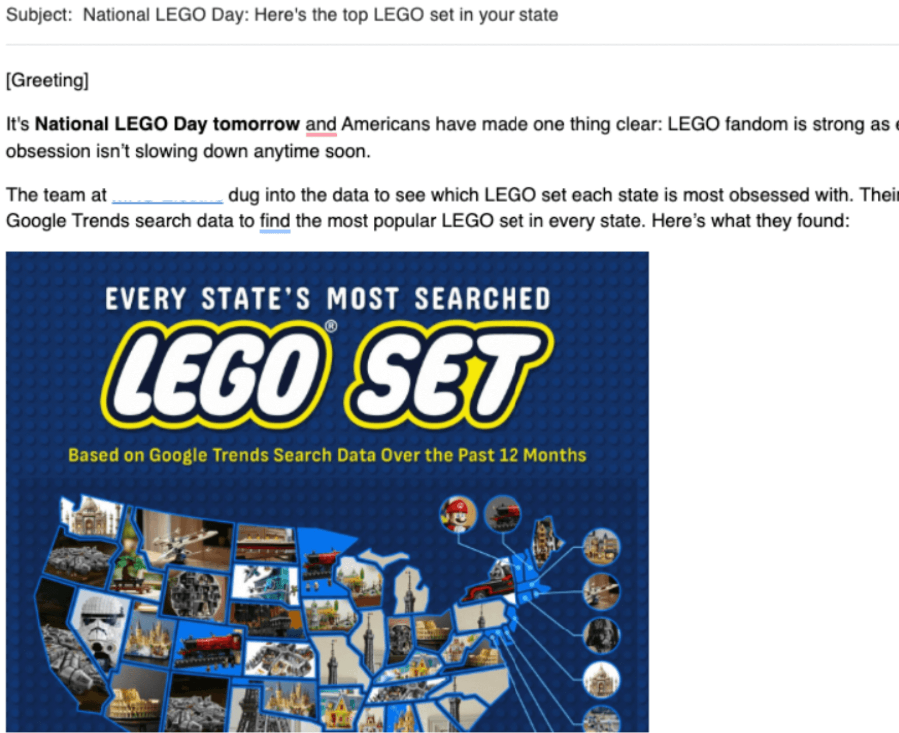
As you can see, the state-by-state breakdown here is very visual, and you can actually see that it was re-shared by journalists covering it:
But maps and data aren’t the only things to share.
Interactive Tool Output
I’ve also seen digital PR pros sharing screenshots from interactive tools.
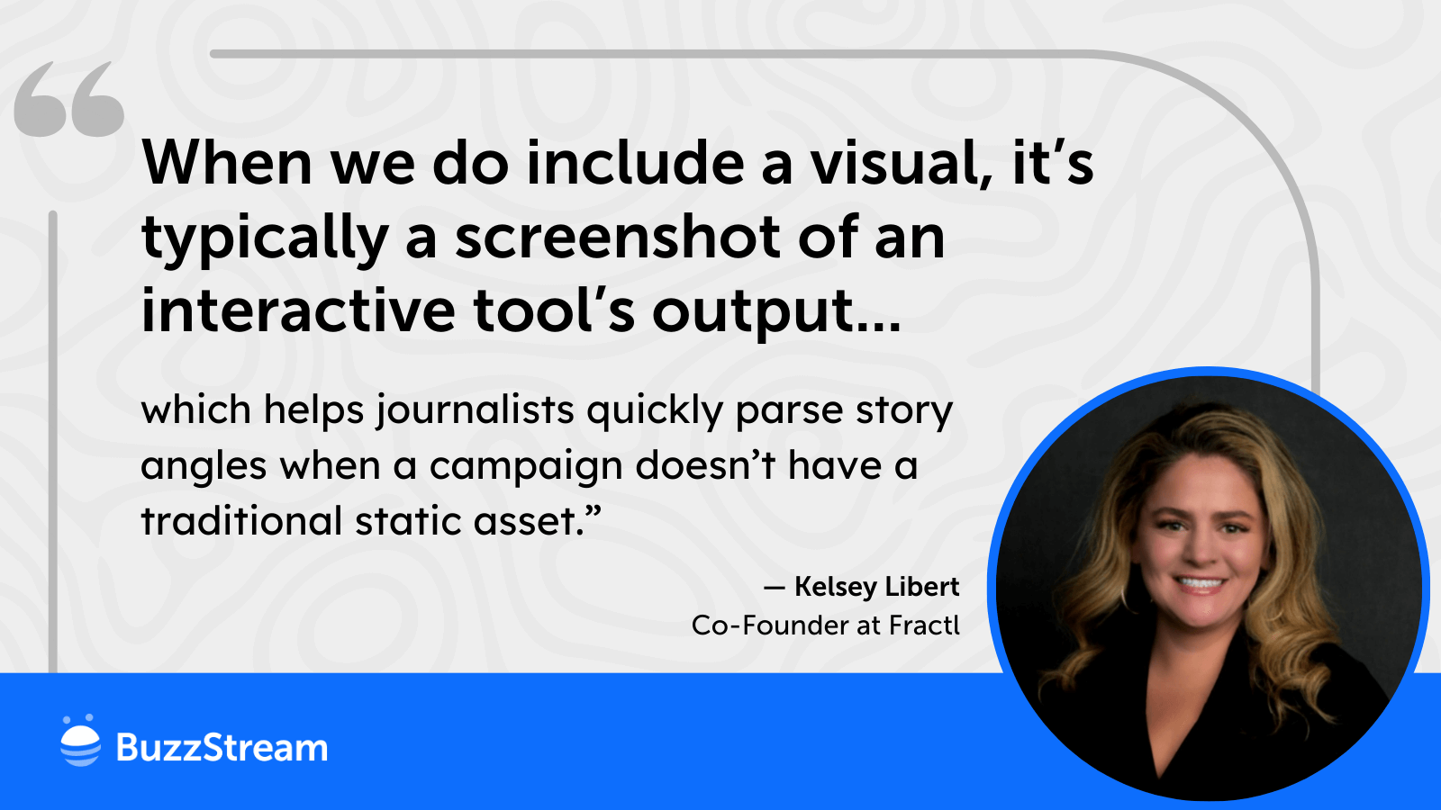
Kelsey Libert, Cofounder – Fractl
“I’d wager 95% of the time, Fractl doesn’t include data visualizations in its pitches, largely to avoid triggering increasingly strict spam filters and because we rarely see visuals used directly in editorial coverage.
Instead, our pitches lead with beat relevance, personalized connections, newsworthy statistics, and actionable SME insights to drive brand mentions.
When we do include a visual, it’s typically a screenshot of an interactive tool’s output, which helps journalists quickly parse story angles when a campaign doesn’t have a traditional static asset.”
For instance, here’s a pitch that shows the results from an ED risk calculator:
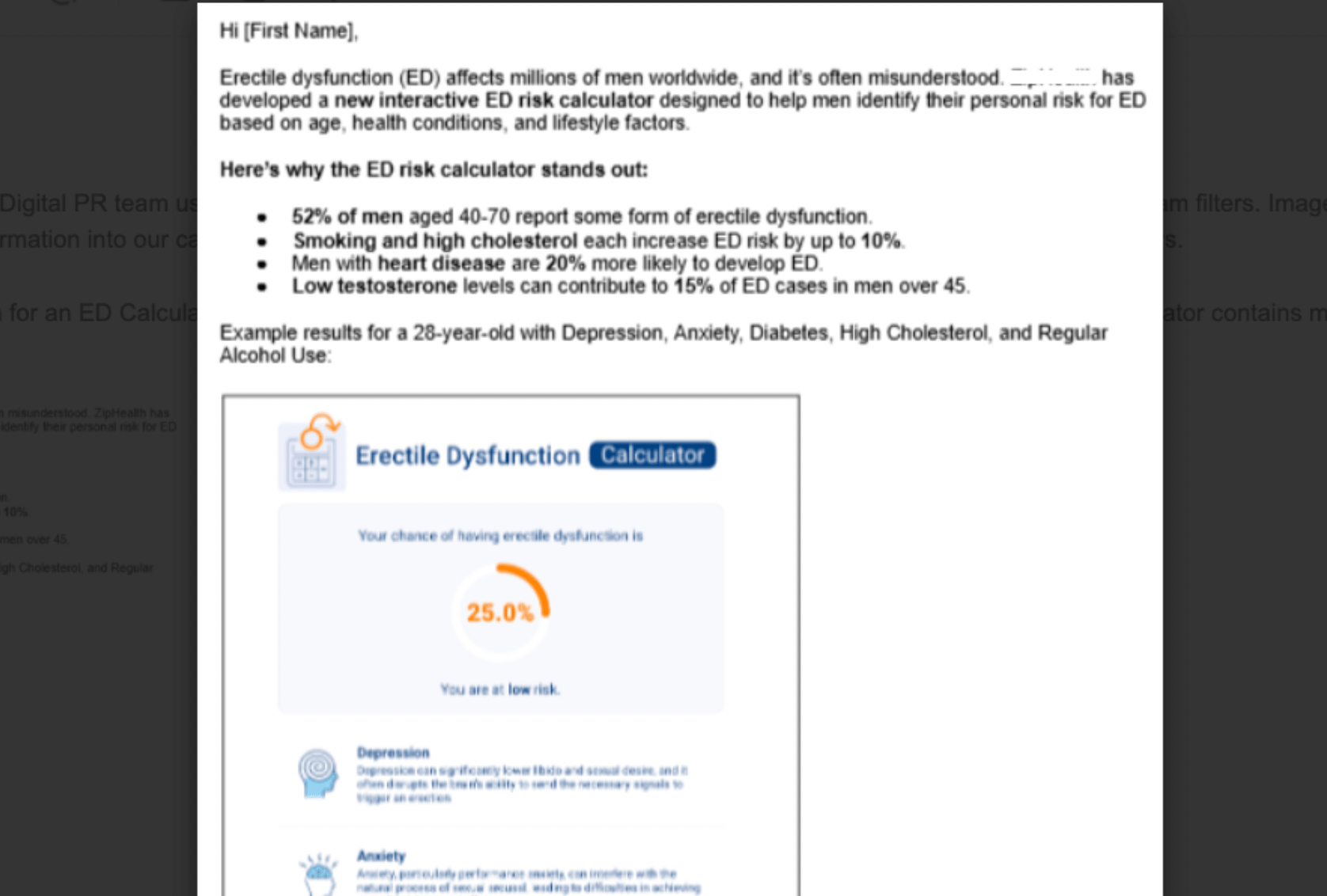
They clearly show the tool’s value and reinforce the data, making the pitch stronger.
Sometimes, journalists will even use screenshots of interactive tools.
For instance, here’s a story from WYSO showing off the State of Ohio’s new voter registration tool:
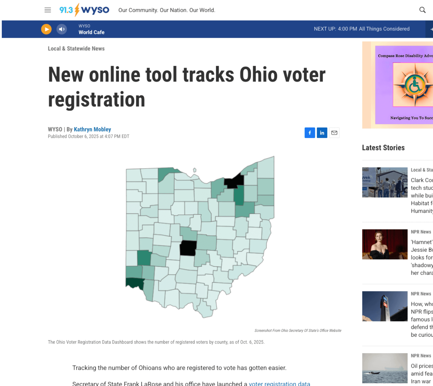
If it saves the journalist a click and helps aid the pitch, it should positively increase your chances of getting the story picked up.
Does the Publication Use External Images?
Another check I like to make is to consider the publication itself.
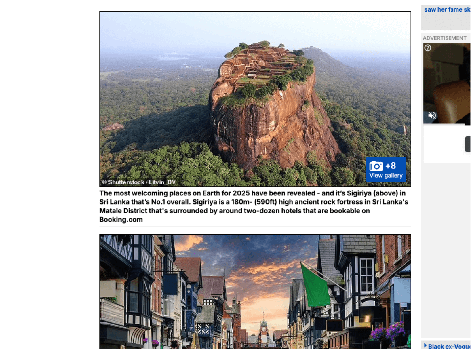
Some outlets clearly share graphics from external sources.
For instance, when covering city indexes, The Daily Mail almost always includes some public-use photos of the places, like this coverage of Booking.com’s World’s Most Welcoming Cities.
In other instances, news outlets recreate images or graphs themselves.
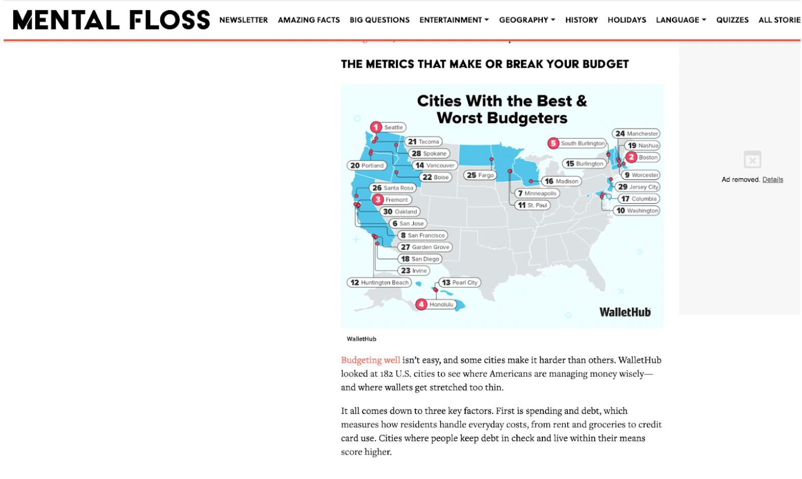
But if I were trying to get coverage on Mental Floss, I should consider pitching a graphic, since they clearly use them in their stories.
Here’s their coverage of Wallet Hub’s Cities with the Best & Worst Budgeters:
This attention to detail means there should be a great deal of personalization in a pitch.
When doing journalist outreach, I use ListIQ to run Google News searches, which helps me quickly find recent articles and author pages and determine whether they use images.
Say I’m pitching a ‘best cities for travel’ piece and want to know if I should include my infographic in the pitch.
I’d do a search with ListIQ enabled.
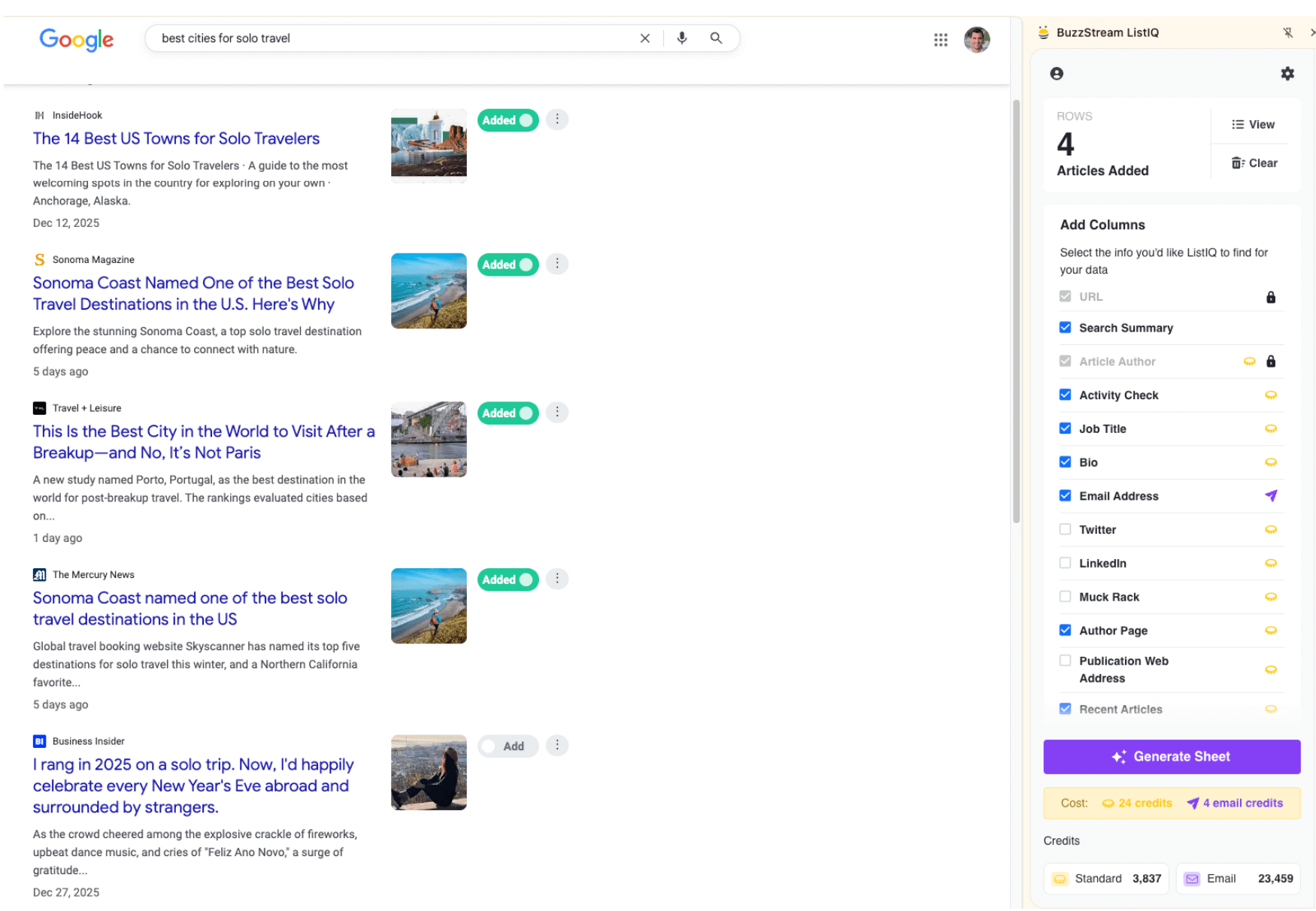
Then I can easily view the author page, click into one of their articles, and see how they are presented.
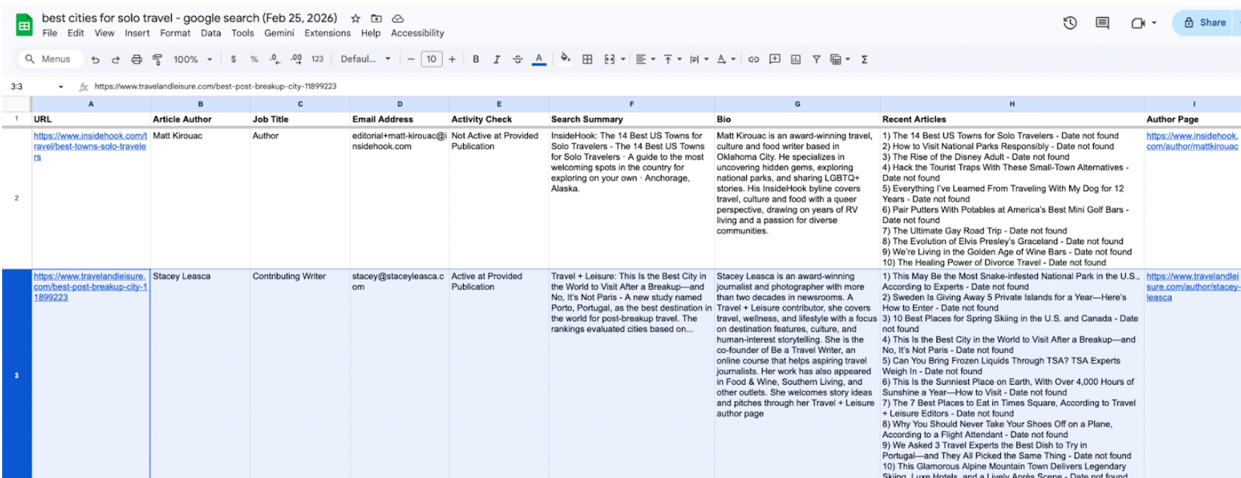
If I see images in their recent articles, especially branded third-party images, I may include a snippet in the email and a link to the full files.
If I don’t see images, unless the image is key to truly understand the crux of the pitch, I would avoid it.
Final Takeaways
The last thing to mention before we close is that including images within your email can increase your likelihood of landing in spam. (Not as much as including them as attachments, though.)
Things that can hurt you include a low text-to-image ratio, excessively large image file sizes, or images hosted on a site with a poor reputation.
Bulk-senders (those who send more than 5,000 emails in a 24-hour period) will definitely have a higher likelihood of ending up in spam folders.
Realistically, though, PR pros who send personalized, targeted outreach shouldn’t run into the same concerns that email marketers do when it comes to image use and spam filters.
When in doubt, use a file-sharing link like Dropbox.
Happy pitching!
Vince Nero
Vince is the Director of Content Marketing at Buzzstream. He thinks content marketers should solve for users, not just Google. He also loves finding creative content online.
His previous work includes content marketing agency Siege Media for six years, Homebuyer.com, and The Grit Group. Outside of work, you can catch Vince running, playing with his 2 kids, enjoying some video games, or watching Phillies baseball.