I’ve tried more Obsidian themes than I care to count. Every time, I end up switching after a few weeks in search of something better. But this one—this one feels different. I don’t think I’ll be switching away from it.
Baseline Is Effortlessly Minimal
When I first came across Baseline, its slogan was “effortlessly minimal.” At first, I rolled my eyes a little. Many Obsidian themes claim the same thing, and they’re not lying—minimalism is baked into Obsidian’s DNA. By design, the app is uncluttered and distraction-free. Everything only shows up when you need it, nothing more.

But Obsidian has another defining quality that’s arguably even more important: customizability. Obsidian bends to your will in a way most apps don’t. You can run it plain and simple, or stack plugins until it feels like a whole operating system. You can ignore the graph view completely or build your entire vault around it. There’s no right way, no FOMO.
That’s where Baseline pulled me in. Its second slogan is “endlessly customizable.” That one got my attention.
Customization Without Limits
If you’ve spent any time theming Obsidian, you’ve probably heard of the Style Settings plugin. It’s what lets theme developers expose customization options—fonts, colors, spacing, and so on. The catch is that you’re limited to what the theme developer decides to make available.
Baseline flips that limitation on its head. Yes, technically, you’re still bound by the developer’s choices—but here, the developer has been generous. You can tweak nearly everything. Fonts, colors, folder indicators, navbars, buttons, and even how the graph view behaves. The level of flexibility almost makes it feel like an official Obsidian v2 theme.
The headings have this sleek, modern typeface that reminds me of Nothing Phone branding. Even better, you can swap it out or fine-tune it through Style Settings.
Right now, I’m writing this using Baseline’s out-of-the-box style. I haven’t touched a single toggle. And it still feels fantastic. I already had it on a secondary vault, but installing it here, in my main writing vault, made me realize just how good it is. I thought I’d revert to my beloved minimal Typewriter Obsidian setup afterward, but I’m not sure anymore.
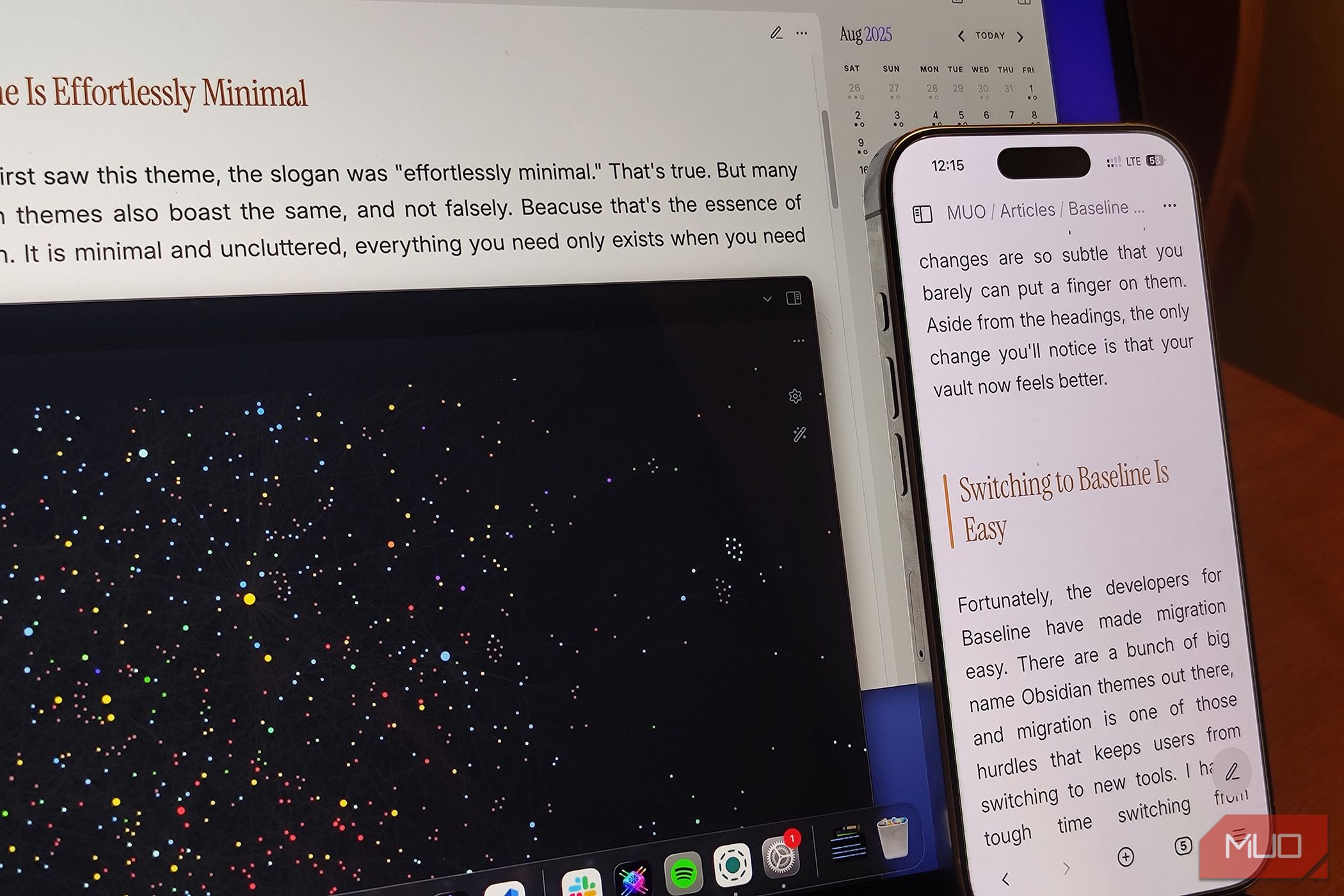
If you’ve been on vanilla Obsidian up until now, the changes Baseline introduces are subtle. You’ll notice the headings first, maybe some spacing tweaks. But the biggest shift is harder to pin down: your vault just feels better.
Switching Over Without the Pain
The biggest reason people stick with old setups—whether it’s browsers, note-taking apps, or themes—is the hassle of migration. I felt it switching from Chrome to Safari despite knowing Safari was objectively better. The same resistance applies here: you’ve already sunk time into customizing your current theme, and starting fresh sounds exhausting.
Baseline solves that problem neatly. It comes with a Migration Tool where you can paste your current theme’s custom style and automatically convert it for Baseline. Install Baseline, apply those settings, and you’re ready to go without losing your tweaks.
That said, I’d still encourage you to try it raw, without bringing over your old setup. You might be surprised how quickly you prefer it.
A Plethora of Options
Baseline feels like Obsidian distilled into a theme. Customizable but elegant by default. Even if you never touch a single toggle, it gives you more than enough polish. But if you’re the type who enjoys personalization, Baseline opens the floodgates.
Colors are where it shines. You can alter nearly every shade used in the interface—or define your own custom palette to call back later. One of my favorite features is “Colorful Headings,” which automatically assigns different colors to different header levels. It’s small but transformative; some color does wonders for navigation.

There’s also accent color syncing, where Baseline pulls your Obsidian accent (default purple) and applies it consistently. Personally, I keep it off to let the chosen scheme breathe, but it’s a nice touch.
And then there are the preset color schemes. Inside Style Settings, under Colors, you’ll find menus for both Light and Dark mode, each with dozens of palettes ready to go. I’m running the macOS preset to match my laptop, and it looks seamless. If you enable Colorful Folders on “Indicator,” your folder tree gets subtle color marks that make collapsed folders easier to parse—something I never realized I needed until I had it.

Baseline includes a toggle to “always show vault switcher.” I immediately enabled it. Add to that a compact status bar, a cleaner primary navigation option, and even a big friendly “new note” button, and suddenly the UI feels both more usable and more personal.
I’m Sticking With Baseline
Baseline doesn’t forget Obsidian’s less-used views either. Canvases are fully skinnable. Graph view is customizable from top to bottom. Even plugins that don’t have official integrations, like Calendar, look naturally at home. It all just clicks.
I’ve tried so many themes that I’ve lost count, but Baseline hits differently. It looks refined right out of the box, yet hands you endless ways to bend it to your taste. That combination means I don’t feel the usual itch to jump ship when a new theme pops up. If I ever want a fresh look, I’ll just flip a few Baseline toggles instead of starting over.
It blends seamlessly with how I use Obsidian, which is probably why it’s the first theme that feels like home. It’s hard to believe this isn’t the official “next-gen” Obsidian theme from the team themselves.